Color Theory for Everyone: Why Warhol’s Palettes Pop
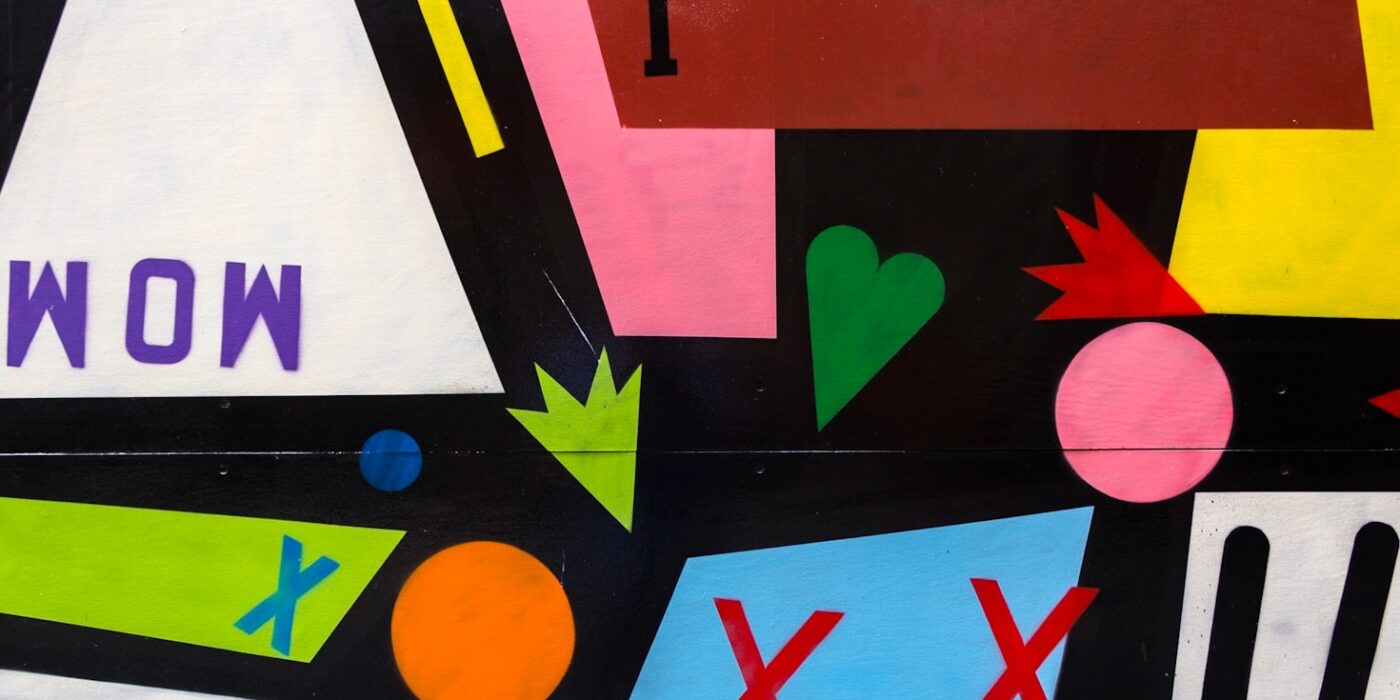
Why does a Warhol print grab your eye from across a room while a thousand other images blur past? The answer is color theory — and you can learn the working core of it in five minutes.
The Three Moves That Matter
1. Complementary contrast. Colors opposite each other on the color wheel — orange/blue, pink/green, yellow/purple — vibrate when placed together. Van Gogh’s starry sky works because chrome yellow stars sit inside deep blue night. Warhol’s Marilyns work because hot pink faces float on acid yellow grounds.
2. Saturation as volume. Fully saturated color shouts; muted color whispers. Warhol printed at full shout on purpose — his subject was mass media, and mass media doesn’t whisper. Dalí, painting dreams, kept his desert golds and blues murmuring. Match your saturation to your message.
3. The 60-30-10 balance. Designers’ oldest trick: roughly 60% dominant color, 30% secondary, 10% accent. It’s why a room, a poster or a website feels composed instead of chaotic. Look at nearly any masterpiece and you’ll find a version of this ratio hiding in plain sight.
Warhol’s Secret Weapon: Off-Register Flatness
Warhol deliberately used flat, commercial, slightly misaligned color — no gentle shading, no realism. Flat color reads instantly, like a traffic sign or a brand logo, which was exactly his point: fame and products are consumed at a glance. When you want instant impact, flatten and simplify.
Train Your Eye
Color recognition is a skill you can practice. Our Color Matcher game shows you real palettes from real masterpieces — eight rounds a day and you’ll start seeing the color architecture inside every image you meet. That’s when design stops being mysterious and starts being yours.